
PROJECT INTRO
Willow & Sage is a botanical skincare concept designed to balance clinical clarity with natural refinement. The identity focuses on restraint, ingredient transparency, and a packaging system built to scale.

THE PROBLEM
The original concept had a clear product story but no visual system to carry it. Without a defined typographic hierarchy, consistent color language, or a scalable packaging structure, the brand blended into a crowded category rather than standing apart from it. The work looked like skincare, but it didn't feel like a brand.

THE OPPORTUNITY
The skincare market is split between two extremes, hyper-clinical minimalism that feels cold, and overtly organic visual language that feels generic. Most brands pick a side. Willow & Sage was designed to live between them, combining botanical warmth with structural precision to feel both trustworthy and refined.

STRATEGY
EXECUTION
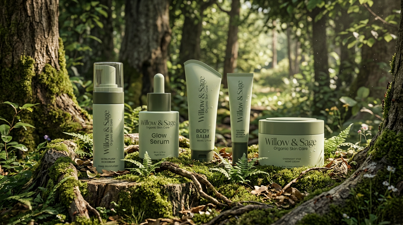
The packaging grid was built to scale across product categories while maintaining consistent ingredient emphasis and hierarchy clarity. Every structural decision was made with SKU expansion in mind, the system works whether there are 3 products or 30.
OUTCOME
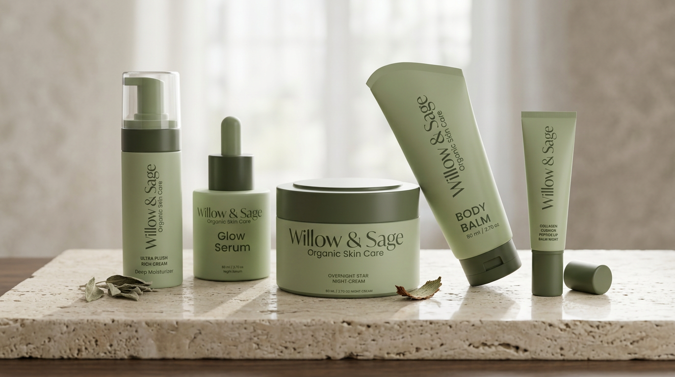
The result is a brand that competes in the premium skincare space without mimicking the visual language of legacy brands. Willow & Sage now has a system ,not just a look. It can grow, expand, and hold its own on shelf next to established naturals without losing what makes it distinct.