Jevonerrgy
Jevonerrgy
Jevonerrgy
Jevonnergy Energy Drink
Conceptual Brand Identity & Packaging System
Jevonnergy Energy Drink
Conceptual Brand Identity & Packaging System
Jevonnergy Energy Drink
Conceptual Brand Identity & Packaging System
PROJECT INTRO
Jevonnergy is a self-initiated conceptual energy drink brand built as focused fuel for creators and high-performance thinkers. The identity challenges the visual chaos of the energy drink category through clarity, geometric precision, and controlled intensity. Designed without a client brief as a demonstration of brand systems thinking from concept to execution
Project Type
Project Type
Brand Identity, Packaging Design
Brand Identity, Packaging Design
Brand Identity, Packaging Design
Category:
Category:
Beverage / Energy
Beverage / Energy
Beverage / Energy
Scope:
Scope:
Logo, Packaging System, Visual Identity
Logo, Packaging System, Visual Identity
Logo, Packaging System, Visual Identity
THE PROBLEM
The energy drink category has a visual language problem. Aggressive typography, neon palettes, and dense compositions dominate shelf space, effective at grabbing attention but ineffective at building lasting brand distinction. Most energy drinks look like they're competing to be the loudest in the room. The result is a category where everything looks the same kind of loud. There was an opening for a brand that projected strength differently.


THE OPPORTUNITY
Creators, athletes, and high-performance thinkers don't always identify with chaos. There's a growing audience that wants energy without the visual noise, people who respond to structure, clarity, and intention. Jevonnergy was designed to own that space. Not quieter than the category. Just more deliberate.
STRATEGY
Focused Energy The identity was built around sustained performance rather than explosive intensity. Every visual decision reinforces the idea that focus is a form of power, not aggression.
Structured Boldness Strong visual presence built on clean geometry instead of distortion or fragmentation. The mark uses geometric precision to communicate strength without relying on the visual shortcuts the category leans on.
Modern Edge High-contrast identity with deliberate restraint. The color system and typography create tension and energy without tipping into chaos — a balance that makes the brand feel premium and purposeful.


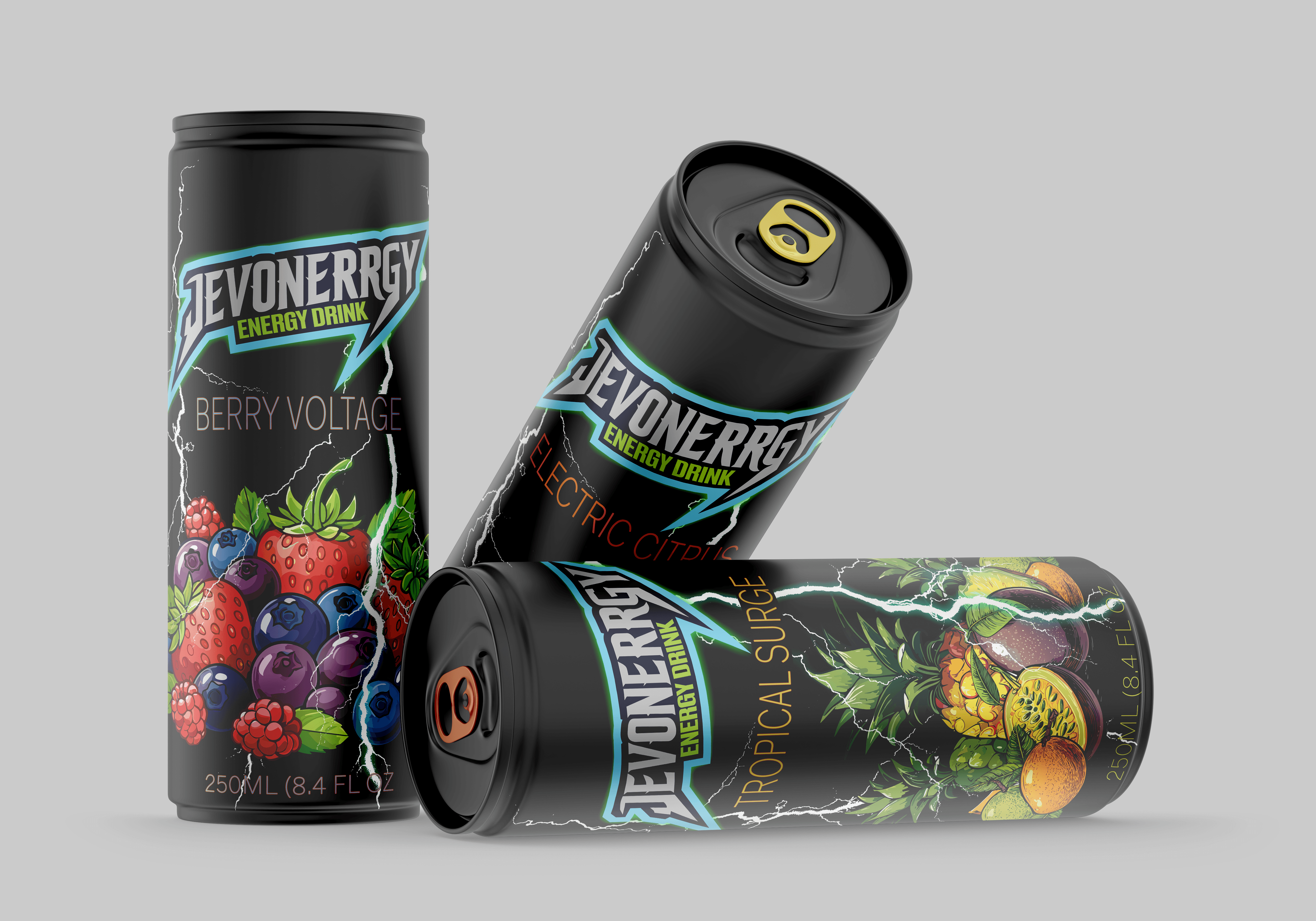
EXECUTION
The packaging grid was designed to scale across product categories while maintaining consistent hierarchy and ingredient clarity. Typography and color work together as a system — each element has a defined role so the brand stays coherent whether it's on a single can or an entire product line.


OUTCOME
Jevonnergy proves that energy and restraint aren't opposites. The brand system stands apart from category norms without abandoning what makes energy drinks visually compelling. It's built for a consumer who performs at a high level and expects their brands to match that standard, and it's a system that can grow as the product line does.
Other Projects


