Vanta Magazine
Vanta Magazine
Vanta Magazine

VANTA Magazine Editorial Design & Art Direction
Conceptual Publication System
VANTA Magazine Editorial Design & Art Direction
Conceptual Publication System
PROJECT INTRO
VANTA is a conceptual contemporary culture and music magazine centered on Black artistry, fashion, and defining industry moments. The project focused on building a bold editorial system that balances cultural urgency with structured, high-contrast design, built to scale across issues without losing its identity.
Project Type
Brand Identity, Packaging Design
Category:
Beverage / Energy
Scope:
Logo, Packaging System, Visual Identity
THE PROBLEM
Editorial design for culture magazines often falls into one of two traps, either visually chaotic layouts that sacrifice readability for attitude, or clean but sterile systems that drain the cultural energy out of the content. VANTA needed a design language that could hold both structured enough to support long-form journalism, bold enough to honor the culture it covers.

THE OPPORTUNITY
Black culture, music, and fashion have historically been documented by publications that didn't always reflect the visual sophistication of their subject matter. VANTA was designed to close that gap, a magazine that looks as considered and powerful as the artists and moments it covers.
EDITORIAL GRID
A six-column modular grid provides structure across long-form journalism and feature layouts. Consistent margins and controlled gutters maintain clarity while allowing flexibility between two-column essays, three-column features, and full-width image spreads. The grid is the backbone — invisible in use but responsible for everything feeling intentional.

STRATEGY
Focused Energy The identity was built around sustained performance rather than explosive intensity. Every visual decision reinforces the idea that focus is a form of power, not aggression.
Structured Boldness Strong visual presence built on clean geometry instead of distortion or fragmentation. The mark uses geometric precision to communicate strength without relying on the visual shortcuts the category leans on.
Modern Edge High-contrast identity with deliberate restraint. The color system and typography create tension and energy without tipping into chaos — a balance that makes the brand feel premium and purposeful.


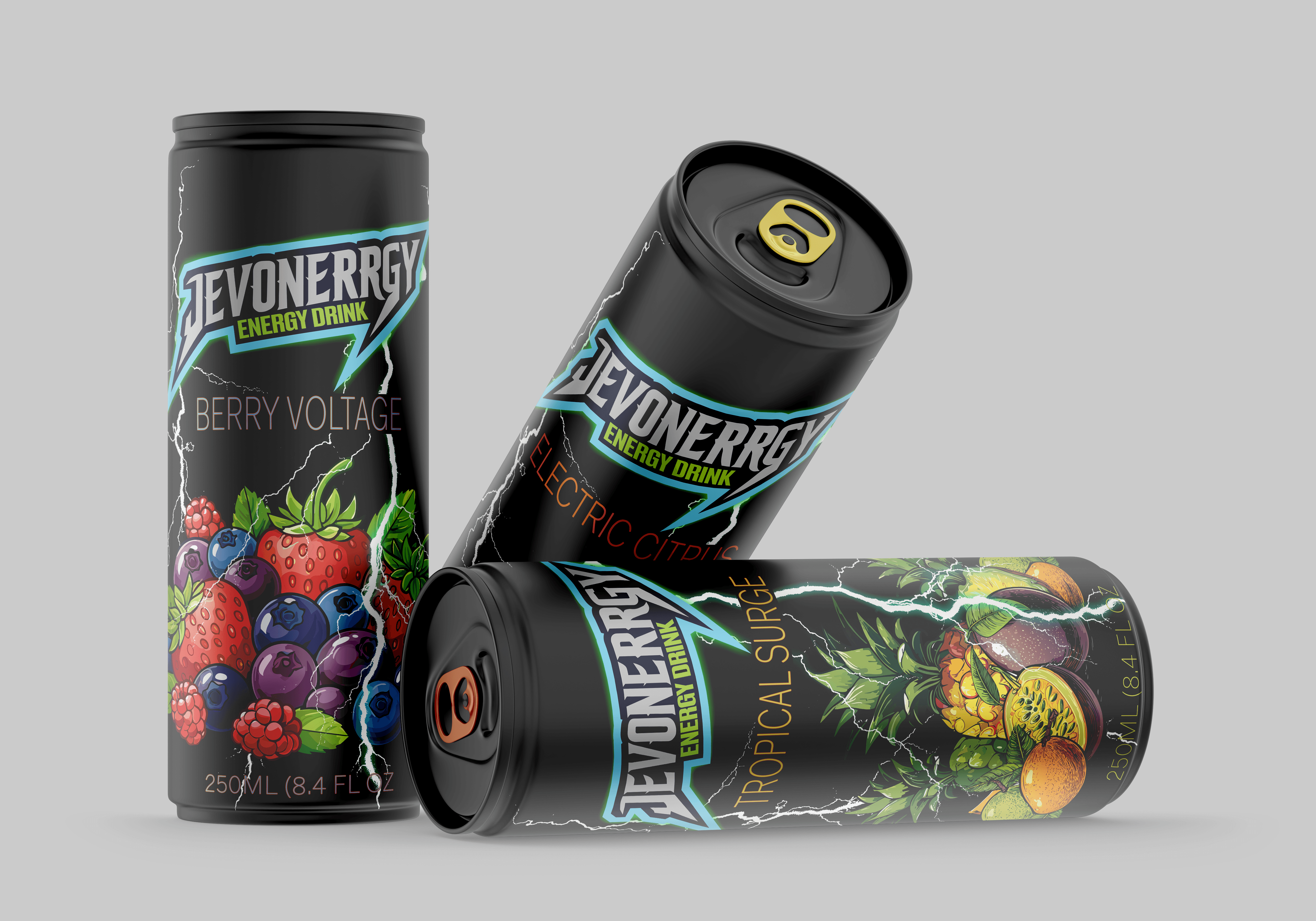
EXECUTION
The packaging grid was designed to scale across product categories while maintaining consistent hierarchy and ingredient clarity. Typography and color work together as a system — each element has a defined role so the brand stays coherent whether it's on a single can or an entire product line.

OUTCOME
Jevonnergy proves that energy and restraint aren't opposites. The brand system stands apart from category norms without abandoning what makes energy drinks visually compelling. It's built for a consumer who performs at a high level and expects their brands to match that standard and it's a system that can grow as the product line does.