Food Club Rebrand
Food Club Rebrand
Food Club Rebrand

Food Club
Peach Iced Tea Drink Mix
Conceptual Retail Rebrand
Food Club
Peach Iced Tea Drink Mix
Conceptual Retail Rebrand
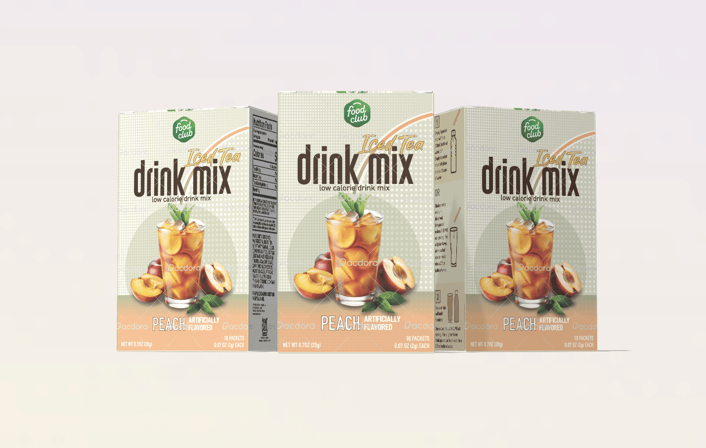
This project is a rebrand of Food Club’s Peach Iced Tea Drink Mix, focused on improving packaging clarity and modernizing its shelf presence.
This project is a rebrand of Food Club’s Peach Iced Tea Drink Mix, focused on improving packaging clarity and modernizing its shelf presence.
Project Type
Project Type
Package Design
Package Design
My Role
My Role
Art Director & Designer
Art Director & Designer
Client
Client
Food Club
Food Club
The Problem
The Problem

The existing packaging struggled with retail clarity and visual hierarchy.
Weak separation between brand and product type
Low flavor visibility
Dense typography
Limited shelf differentiation
The existing packaging struggled with retail clarity and visual hierarchy.
Weak separation between brand and product type
Low flavor visibility
Dense typography
Limited shelf differentiation
The existing packaging struggled with retail clarity and visual hierarchy.
Weak separation between brand and product type
Low flavor visibility
Dense typography
Limited shelf differentiation

Competitive Landscape
Competitive Landscape
In a crowded powdered beverage category, products compete primarily through flavor clarity
and color differentiation.
Clear typographic tiers
Improved shelf recognition
High-contrast flavor coding
In a crowded powdered beverage category, products compete primarily through flavor clarity
and color differentiation.
Clear typographic tiers
Improved shelf recognition
High-contrast flavor coding
Strategy
Strategy
Hierarchy System
Established a 3-tier typographic structure to separate brand, product type, and flavor.
Hierarchy System
Established a 3-tier typographic structure to separate brand, product type, and flavor.
Flavor-First Color System
Introduced scalable color banding to improve recognition and SKU expansion.
Flavor-First Color System
Introduced scalable color banding to improve recognition and SKU expansion.
Simplified Composition
Reduced visual noise to prioritize product photography and readability.
Simplified Composition
Reduced visual noise to prioritize product photography and readability.


The layout was structured for panel clarity, balancing front-facing impact with instructional and nutritional information hierarchy.
The layout was structured for panel clarity, balancing front-facing impact with instructional and nutritional information hierarchy.